#cranbrook press
Explore tagged Tumblr posts
Photo
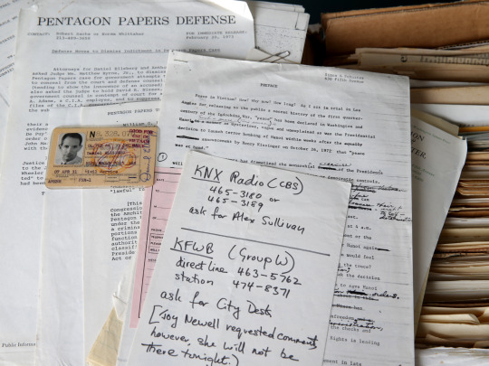
Daniel Ellsberg, who has died aged 92, was the most important whistleblower of our times. His 1971 leaking of what became known as the Pentagon Papers showed conclusively that virtually everything the American public had been told by its leaders about the Vietnam war, from its origins to its current conduct, was false.
The leak itself did not end the war, and Ellsberg regretted not having come forward years earlier. He spent the rest of his life as a peace activist, encouraging others on the inside to reveal government malfeasance, and supporting those who did, including the 2003 GCHQ whistleblower Katharine Gun. But his leaks did result in a landmark decision in favour of freedom of the press, and, ironically, led to the downfall of the US president Richard Nixon. It is not unreasonable to set Ellsberg’s leak alongside President John F Kennedy’s assassination as the ground zero of today’s distrust of politics.
Before working on the Pentagon Papers, officially a study titled A History of Decision-Making in Vietnam 1945-68 commissioned from the Rand Corporation research organisation by the secretary of defense Robert McNamara, Ellsberg had spent two years at the US embassy in Saigon, advising on General Edward Lansdale’s “pacification” programme. As he sifted through the material gathered for the report, including evaluations which deemed the war unwinnable, he realised the enormity of the political fraud.
He began copying the documents, with the help of a former Rand colleague Anthony Russo, and in 1971, as the US extended the war with bombings of Laos and Cambodia, resolved to make them public. The chair of the senate foreign relations committee, William Fulbright, turned him down, as did the Washington Post’s editor Ben Bradlee and owner Katharine Graham; Graham was close to the secretary of state Henry Kissinger, who had known Ellsberg at Harvard; he advised her Ellsberg was “unbalanced and emotionally unstable”. Matthew Rhys played Ellsberg in the 2017 film The Post which loosely covers those events.
Neil Sheehan of the New York Times was a reporter Ellsberg admired in Vietnam; Sheehan convinced the Times to take the papers, the first instalment of which revealed that the Gulf of Tonkin incident, the casus belli which launched full-scale US participation in the conflict, had been bogus.
The Nixon administration obtained an injunction prohibiting further publication; the supreme court’s overturning of that injunction, dismissing the idea of “prior restraint”, remains a cornerstone of US journalistic freedom. But leakers themselves were not protected. Ellsberg was hidden by anti-war activists while Mike Gravel, the US senator from Alaska, entered most of the leaked papers into the congressional record, and the Post played catch-up.
Meanwhile Nixon, furious at the leaks, created the so-called “plumbers” covert special investigation unit, to discover if Ellsberg had further material that might affect him directly, and to discredit him. When the plumbers’ bungled break-in at the Watergate offices revealed an earlier burglary of Ellsberg’s psychiatrist’s office, the ensuing chain of scandal and cover-up eventually forced Nixon’s resignation to avoid impeachment.
Ellsberg grew up the very definition of a true believer in America. Both his father, Harry, a structural engineer, and mother, Adele (nee Charsky), were the children of Russian Jewish immigrants, but had converted to Christian Science. When Daniel, born in Chicago, was six, his father found work in Detroit, building Ford’s massive Willow Run factory.
Daniel won a scholarship to the elite Cranbrook school in the Detroit suburbs; a talented pianist, he practised for four to six hours a day to fulfil his mother’s dream. But in 1946, rushing to Denver for a family gathering, his father fell asleep while driving and rammed into a bridge. His mother and younger sister, Gloria, both died; Daniel recovered from his severe injuries, but ceased playing the piano.
He won a scholarship to Harvard, where he studied economics, edited the college paper, and finished third in his class. Upon graduation he married a Radcliffe student, Carol Cummings, whose father was a colonel in the Marine Corps, and took up a Wilson fellowship for a year’s study at King’s College, Cambridge. In 1954, accepted as a Harvard junior fellow to pursue his doctorate, he instead joined the Marines, becoming a rare first lieutenant given command of a full company.
He returned to Harvard in 1957. His dissertation, Risk, Ambiguity and Decision, contained what is now known as the Ellsberg paradox, which delineated how the preference for well-defined probabilities, over the uncertainty of ambiguity, influences decision-making, especially as it reinforces preconceived ideas. It became an important part of game theory, and Ellsberg went to work for Rand on the Department of Defense’s Command and Control research, much of which was devoted to spit-balling Fail Safe/Dr Strangelove scenarios, as detailed in his 2017 book The Doomsday Machine: Confessions of a Nuclear War Planner.
In 1964 he went to the Department of Defense, as special assistant for international security to McNamara’s number two, John McNaughton, before moving to the State Department and Vietnam. In 1967 he rejoined Rand to work on McNamara’s project, but was increasingly tormented by Kissinger and Nixon’s Vietnam policy; they believed that if the US opened relations with China and entered into a detente with Russia, those countries would pressure North Vietnam to come to the table while the US bombed incessantly.
Ellsberg began joining anti-war campaigners, including the poet Gary Snyder, and was inspired by Randy Kehler, a draft-resister who spoke of welcoming imprisonment for his belief. Ellsberg left Washington for MIT’s Centre for International Studies a year before leaking the papers. His first marriage had ended in divorce; in 1970 he married Patricia Marx, a peace activist.
In June 1971, he surrendered himself to the US attorney in Boston; asked on the courthouse steps how he felt about going to prison, Ellsberg replied: “Wouldn’t you go to prison to end this war?” He became the first civilian charged with violating the 1917 Espionage Act, and faced a maximum sentence of 115 years. The District Court judge William Byrne ruled irrelevant his public-interest defence, that the documents were “illegally classified”, and so it has been for every whistleblower since. But Byrne eventually dismissed the case because of government malfeasance, including the plumbers’ break-ins, as well as Nixon’s wiretapping of Kissinger’s aide Morton Halperin, and John Ehrlichman’s offering Byrne the directorship of the FBI.
In 1974, Ellsberg’s moving interviews were a major part of the Oscar-winning Vietnam documentary Hearts and Minds. In 1978 he was awarded the Gandhi prize by Promoting Enduring Peace. In the next 40 years he was arrested around 50 times at anti-war protests. He likened the weapons of mass destruction excuse for invading Iraq in 2003 to the Gulf of Tonkin affair, and over the years supported leakers who revealed government deceptions, including Edward Snowden, Chelsea Manning and Reality Winner, who was sentenced to five years in prison for leaking a single page from an in-house National Security Agency magazine showing the NSA had concluded Russia interfered in US elections, while the government was maintaining they had not.
He recognised a practical corollary to the Ellsberg paradox: the more secrets you are able to access, the less able you become to act sensibly with them. In 2021, Ellsberg released government memos from 1958, showing that the joint chiefs of staff had prepared a nuclear first-strike against Chinese bases on Quemoy and Matsu during the Taiwan Strait crisis, with a full nuclear attack planned on China should they respond. His point was that little had changed since the Pentagon Papers.
Ellsberg was played by James Spader in the 2003 film The Pentagon Papers, and was the subject of a 2009 documentary, The Most Dangerous Man in America. His memoir, Secrets, appeared in 2003 and in 2021 Risk Ambiguity and Decision was updated as a book, once again challenging the concept of rational decision.
Ellsberg is survived by his wife and their son, Michael, and his son, Robert, and daughter, Mary, from his first marriage.
Daniel Ellsberg, military analyst and political activist, born 7 April 1931; died 16 June 2023
Daily inspiration. Discover more photos at http://justforbooks.tumblr.com
23 notes
·
View notes
Photo

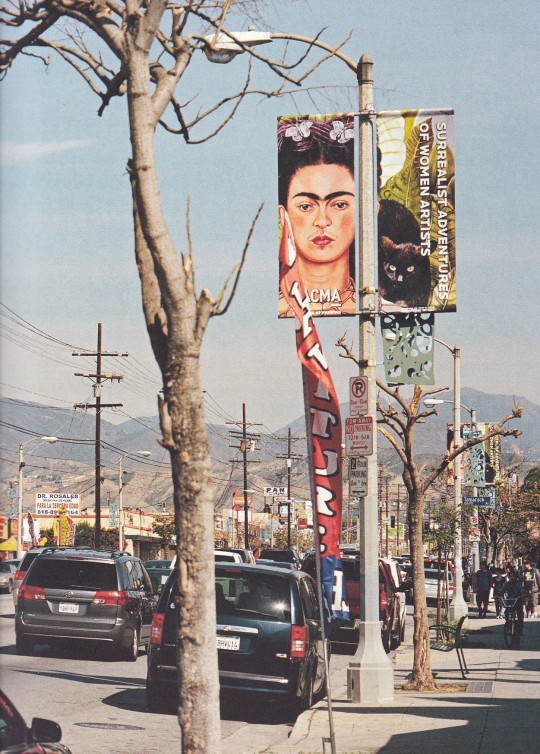
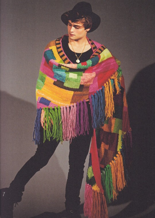
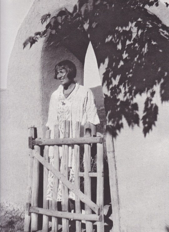

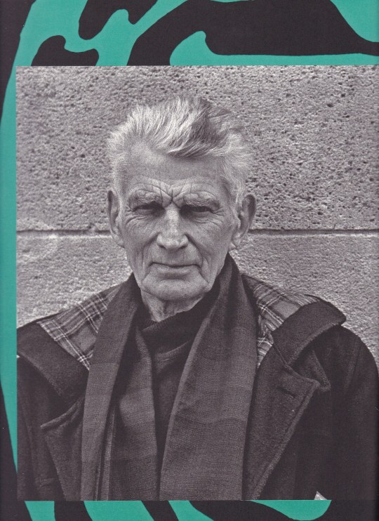
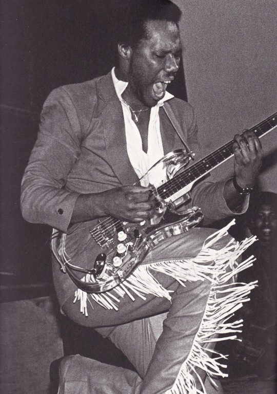

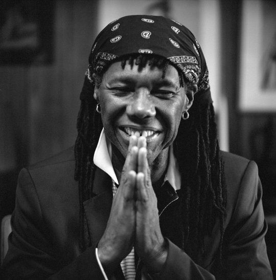
All-American Volume Twelve A Book of Lessons
Editors Bruce Weber, Nan Bush, Nathaniel Kilger, Matthew Richards, Skylar Pittman
teNeues, Augsburg 2012, 192 pages, Housed in slipcase, 26 x 32 cm, ISBN 9783832796679
euro 38,00
email if you want to buy [email protected]
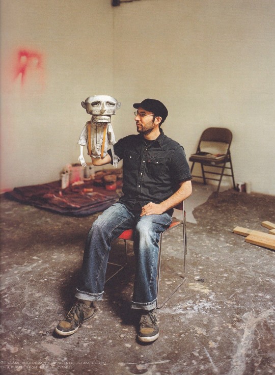
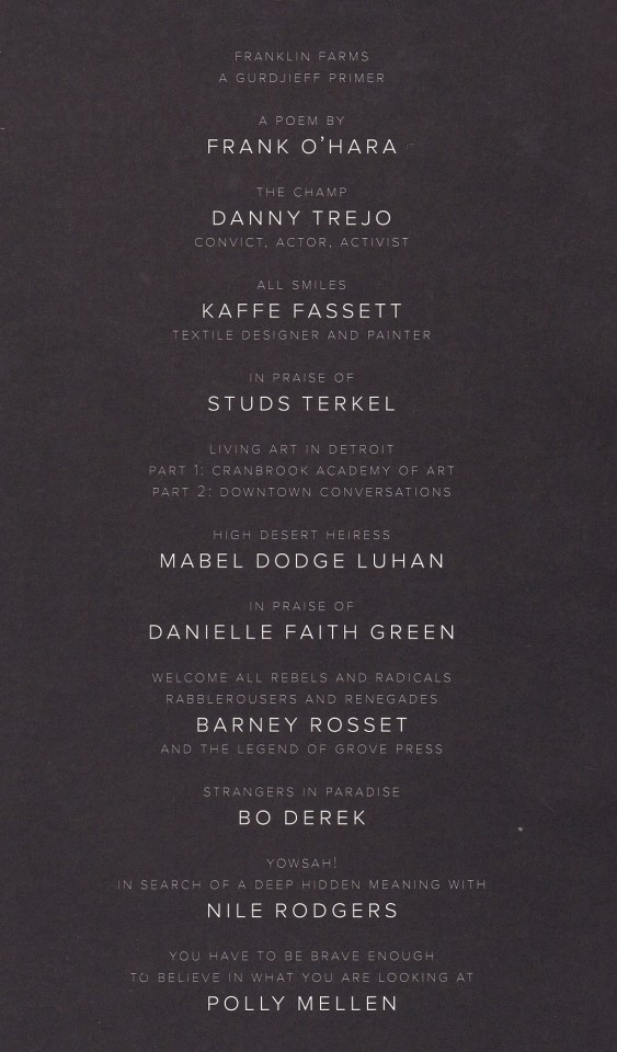
All-American Volume Twelve: A Book of Lessons presents an eclectic lineup of American talents whose potent personalities and creative works exemplify freedom, conviction and inspiration. The “lessons” of the book are discovered through their individual journeys, actor and activist Danny Trejo narrates his unlikely path to fame, Polly Mellen speaks to the importance of curiosity throughout her illustrious career as a fashion editor, and musician/producer Nile Rodgers sheds light on his hit-making alchemy. The evolving art scene in Detroit is considered from two perspectives; first through an examination of student works and the craft tradition at the Cranbrook Academy of Art, then through conversations with prominent arts organizations in the downtown area. The book also features tributes to the late Grove Press publisher Barney Rosset, the Chicago-based oral historian Studs Terkel and the socialite turned Taos activist Mabel Dodge Luhan.
In addition to extensive original photography and interviews by Bruce Weber, “All-American Volume Twelve: A Book of Lessons” includes commissioned work by Poppy de Villeneuve and Carlos Charlie Perez, previously unpublished photographs by John Derek, and poetry by Frank O’Hara and Danielle Faith Green, a young Brooklyn-born writer.
This is the first year that “All-American” is published in conjunction with teNeues Publishing Group, bringing Bruce Weber’s book to a much broader international audience.
This book is dedicated to the memory of Anna Piaggi
24/07/22
orders to: [email protected]
ordini a: [email protected]
twitter: @fashionbooksmi
instagram: fashionbooksmilano, designbooksmilano tumblr: fashionbooksmilano, designbooksmilano
#AllAmerican volTwelve#Bruce Weber#photography books#American talents#freedom#convinction#inspiration#Kaffe Fassett#Polly Mellen#Bo Derek#Frank O'Hara#Nile Rodgers#fashionbooksmilano
55 notes
·
View notes
Text
Black Women in Visual Media
Like the previous blog, this blog will highlight multiple Black Women in Visual Media. Not to be considered just painters or collage makers or sculptors, these women are held highly as innovators and visionaries in the art community. In no particular order, this blog will bring a quick glimpse into just a few of these Black Women creators in modern world visual media.

Delita Martin, born in 1972 in Conroe, Texas, received her BFA in drawing at Texas Southern University in Huston, Texas in 2002. In 2009, she then later earned her MFA in printmaking at Purdue University. Knowing that she wanted to pursue art since the age of five, she became a multidisciplinary artist and has worked across various mediums such as printmaking, painting, and stitching, the latter incorporating indigenous and modern art-making. Martin actively uses storytelling to provide a platform for marginalized Black women and frequently uses various forms of symbolism to represent women in her artwork. Much of her work contains West African masks, similar to Loïs Mailou Jones from a previous blog, which highlight the connection between the mortal and spiritual world. Martin's influences include Elizabeth Catlett after she was exposed to her work as an undergraduate student.
In 2008, Martin founded her own studio called Black Box Press while also working as a lecturer at the University of Arkansas at Little Rock from 2008 to 2012. She is also a founding member of Black Women of Print, founded in 2018 which acts as a printmaking collective for Black Women, as well as a ROUX artist collective member.
Her work has appeared in the Havana Biennial and in Art Basel Miami and she has permanent collections held by many museums including the following; National Museum of Women in the Arts, Salamander Resort, Minneapolis Institute of Art, Bradbury Art Museum, C.N. Gorman Museum, Crystal Bridges Museum of American Art, David C. Driskill Center, Petrucci Family Foundation Collection of African American-Art, Studio Museum in Harlem, Thrivent Financial, William J. Clinton Presidential Library and Museum, the US Embassy (Mauritania) and more.

Ruby Onyinyechi Amanze, born in 1982 in Nigeria, is a Nigerian-British Brooklyn based artist. Having been raised in the United Kingdom until the age of 13, she moved to America in 2004. She received a B.F.A. summa cum laude from the Tyler School of Art at Philadelphia's Temple University and received her M.F.A from Cranbrook Academy of Art, in Bloomfield Hills, Michigan, majoring in photography and textiles even though her favorite and most used medium is drawing. She currently resides in Brooklyn, New York where she continues to work with graphite, ink, and pigment drawings, often combining them with photo transfers, with many of her mixed-media drawings centering on the concept of cultural hybridity and displacement. She draws much of her inspiration from Nigerian artists and the Nigerian history of drawing.
Amanze was an Artist-in-Residence at the Cooper Union School of Art in New York, NY in 2011, in 2012 she earned a Fulbright Fellowship, and later received the Fulbright Scholars Award for Teaching/Research at the University of Nigeria, Nsukka the following year. She then became an Artist-in-Residence at the Lower Manhattan Cultural Council in 2014 and at the Fountainhead Residency in Miami, Florida in 2015. Amanze also participated in Opens Sessions at the Drawing Center, New York from 2015 to 2016 and was an Artist-in-Residence yet again at the Queens Museum in Queens, New York, from 2016 to 2017.

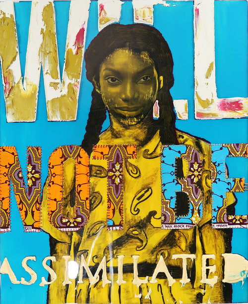
April Bey grew up in New Providence, The Bahamas, and earned her BFA from Ball State University in 2009 and her MFA in painting at California State University in 2014. Bey’s work has been exhibited at Band of Vices Gallery, Coagula Curatorial, Liquid Courage Gallery, and Barnsdall Art Park’s Municipal Art Gallery and she currently teaches in the department of Studio Arts at Glendale Community College.
Bey is best known for her mixed media work which mostly includes collage work that intertwines various materials such as caulking, resin, wood, and fabric. She uses her work to create commentary on contemporary Black Female rhetoric and attempts to capture strength, power, passion, and sensuality. Her work also explores the resilience of women as well as the hypocrisy of societal expectations towards women. Bey commonly uses photographs of Black Female figures such as Chimamanda Ngozi Adichie, Solange, Issa Rae, and Michaela Coel and adds text which speaks of the narratives Black Women are creating regarding their identity in modern times.

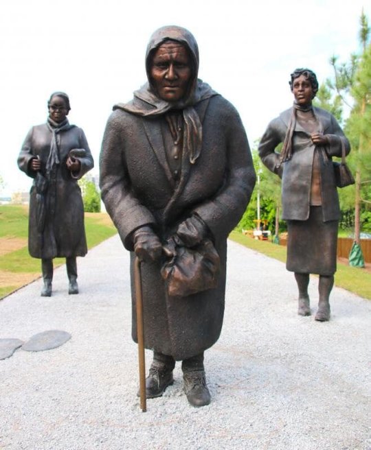
Dana King was born on March 7th, 1960, in Cleveland, Ohio, and served as a news anchor for San Francisco CBS Affiliate KPIX and a co-anchor on ABC's Good Morning America Sunday in the early ’90s before moving to CBS's CBS Morning News during the mid-’90s as well as other CBS News programs. King was well recognized for her career in journalism, even receiving a local Emmy for her reporting in Honduras in 1998 and 2000 and an RTNDA Edward R. Murrow Award in March 2005. Eventually, King ended up leaving her anchoring job in 2012 to pursue an art career and follow her passion for sculpting.
King's mediums include charcoal drawing and oil painting but she is best known for her sculptures as well as many community projects that revolve around portraying political messages, stemming from her career as a journalist. One of her best-known sculptures is an outdoor sculpture dedicated to the memory of the women who led and sustained the Montgomery bus boycott which is currently on display at the National Memorial for Peace and Justice in Montgomery, Alabama, as of 2018. Not just an artist and ex-news anchor, King is also an entrepreneur, owning a thriving artists’ enclave located in Oakland, California. She also donated space from the building she owns at East 12th Street and 13th Avenue in Oakland, California to the Oakland community to paint a mural with the theme of “Oakland for all of us.” King donated the wall in hopes of bringing the community together and bringing awareness to political change.
There are so many other artists and influential Black Female visual creators out there making a mark on the world through innovative means and consisting of important messages. It’s a common theme among these artists that portraying the beauty of Black Women and women, in general, can be done elegantly and gracefully. There are powerful messages held in all of their work and their craft acts as an inspiration to women across the globe.
10 notes
·
View notes
Text
182 unmarked graves found near former residential school outside Cranbrook, B.C.
Another Indigenous community in B.C. says ground-penetrating radar has found human remains near a former residential school.
In a statement released Wednesday, the Lower Kootenay Band said remains of 182 people were found in unmarked graves close to the former St. Eugene's Mission School near Cranbrook.
The statement says the Aq'am community conducted the search in 2020. It also says the residential school operated from 1912 to the 1970s.
"Some of the findings had the human remains buried in shallow graves only three to four feet deep," the statement says, explaining the Lower Kootenay Band is a member band of the Ktunxa Nation.
"Many Lower Kootenay Band members were forced to attend the St. Eugene's Mission School."
About 100 band members attended that residential school, the statement says.
The announcement comes just over a month after the Tk'emlups te Secwepemc First Nation announced the remains of 215 children were found buried on the site of a former residential school in Kamloops.
Weeks later, the Cowessess First Nation said 751 unmarked graves were found near a former residential school in Saskatchewan.
About 150,000 First Nations, Inuit and Metis children attended residential schools. Families who resisted the system had children forcibly taken away by the RCMP.
The schools were known for overcrowding, poor sanitation, unhealthy food and menial labour. Harsh punishment was given to students who spoke their native language or took part in traditional ceremonies.
With files from The Canadian Press
If you are a former residential school student in distress, or have been affected by the residential school system and need help, you can contact the 24-hour Indian Residential Schools Crisis Line: 1-866-925-4419.
Additional mental-health support and resources for Indigenous people are available here.
from CTV News - Atlantic https://ift.tt/3qAbz2O
1 note
·
View note
Text
Furniture Designer, Sculptor, and Artist Paul Evans


Paul R. Evans popularly known as Paul Evans was the main figure in the mid-century American studio and brutalist furniture development. Evans reliably pushed limits with his imaginative ways to deal with metalsmithing and furniture production. Paul Evans furniture has a special attraction. His otherworldly works, which challenged what regular items resembled and how they were made, keep on uncovering the entrancing crosscurrents among figure and plan. Evans started working with metal in the mid-1950s—first at the Rochester Institute of Technology's School for American Craftsmen (SAC) in Rochester, New York, where he concentrated under the persuasive American silversmiths and fashioners John (Jack) Prip and Lawrence Copeland, and later at the Cranbrook Academy of Art in Bloomfield Hills, Michigan. Evans at that point moved to Sturbridge Village, Massachusetts, where he functioned as a full-time skilled worker, showing different silversmithing strategies at Old Sturbridge Village, a living gallery that re-makes life in provincial New England during the eighteenth and nineteenth hundreds of years. In 1955, looking for a difference in landscape, Evans moved to Lambertville, New Jersey, a notable asylum for specialists and experts, and opened a workshop in a previous chicken coop.
He before long got to know the self-educated furniture creator, Phillip Lloyd Powell, who urged Evans to take his metallurgy abilities and apply them to furniture. For the following ten years, the team shared a display area in close by New Hope, Pennsylvania, and worked together on pieces that merged Powell's wood ability and Evans' metalworking abilities. The last part of the 1950s and 1960s was an unfathomably significant period for Evans as his workshop activity proceeded to develop and he started creating a portion of his most praised structures. In 1964, Paul Evans turned into an included creator for the furniture maker Directional Furniture, an affiliation that fundamentally affected the nature and extent of his creation. As a result his style became so popular that now there are Paul Evans furniture auction and sales held times and again.
Evans pieces were often marked, and a portion of the custom things suffer a heart attack and a date. Evans' mix of handcraft and innovation expected the restricted release craftsmanship furniture of today. The craftsman's relationship with Directional Furniture set a one of a kind norm for innovative assembling by demanding each piece be made by hand, wrapped up by hand, and regulated by the craftsman at each progression of creation, each piece in turn.
Evans presented a few lines, including the Sculpted Bronze arrangement (the mid-1960s), which included applying epoxy gum over a pressed wood base or steel outline, molding it by hand, and covering it with atomized bronze; the Argente arrangement (late 1960s to mid-1970s), which highlighted aluminum and color mixed metal surfaces welded together (a cycle that was considered profoundly harmful and immediately deserted) to make unique structures; and the well-known Cityscape arrangement (1970s), which was motivated by the Manhattan horizon. Flaunting smooth, rich surfaces made of metal and chrome, the Cityscape arrangement contrasted enormously from Evans' etched steelworks of the 1960s, which were painted and exceptionally finished. The Cityscape arrangement earned huge acknowledgment for Paul Evans furniture and set up Directional Furniture as quite possibly the most remarkable mid-century configuration organization of the 20th century. In 1966, Evans moved to Plumsteadville, Pennsylvania, where he opened a bigger workshop. Free of his work for Directional, Evans kept on making models, produce commissions, and specialty his commended design front screens, sideboards, arrangements, seats, and tables, which highlighted high-alleviation, hand-manufactured beautiful components. In 1979, Evans opened a second display area in New York City. Evans passed on of a coronary failure in 1987, not long after resigning to Massachusetts.
In the 21st century, Evans' work climbed in standing, making it among the most collectible in the plan market. Gwen Stefani, Lenny Kravitz, and Tommy Hilfiger were accounted for to be among devoted gatherers. Evans cupboards and bookshelves started to sell for more than $250,000 at closeout. In 2014, the James A. Michener Art Museum, in Doylestown, Pennsylvania, arranged a review of Evans' work. In 2017, an Evans bureau sold at sell off for $382,000. Interested people can find Paul Evans furniture for sale online.
1 note
·
View note
Text
The Historic TWA Terminal and Lockheed Consellation at JFK
Presentation:
As I passed the control stopped convertible and entered the https://moneymofo.com/ entryways of the Eero Saarinen-planned TWA Terminal with its winged, flight-proposing rooftop at JFK International Airport on a mid-September day, nothing, I noted, had changed, then again, actually the traveler registration counters flanking either side were refreshingly without lines. Maybe that ought to have been a clue.

Mounting the dozen steps and afterward redescending those that prompted the natural Sunken Lounge, I looked at the Solari split-fold appearances and flights load up, its boards intermittently flipping and clattering like stacking poker chips, however they just uncovered clear squares. There were no flight numbers, no occasions, and no objections.
However by perspectives on the vintage aircrafts on the slope through the floor-to-roof calculated glass showing TWA's red-and-white uniform, yet deficient with regards to a solitary stream motor, my objective today must be marked "history" or, even "flying history." Perhaps that was suitable for the "gear" I brought: a carry-on comprising of a clipboard and a pen.
The scene before me was a suspended one. The time frame music and the declarations repeating through my head moved me to the one I was not in.
"TWA Starstream Flight 802 to Paris, presently loading up at entryway one," they said.
My eyes, examining past the area of the once popular and recognizable Brass Rail Restaurant toward the double, fundamental terminal interfacing tubes actually secured with bean stew red pepper covering to the flight zone, I completely expected to take in at least one Boeing 707-320Bs with their gruffly pointed, radome noses, 35-degree cleared wings, and Pratt and Whitney JT3D-3B low detour proportion turbofans.
However the Lockheed L-1649A Starliner Constellation, speaking to the apex of-cylinder improvement, demonstrated that the time safeguarded and portrayed "out there" was not the one my psyche attempted to persuade me actually existed "in here." Instead, it was twenty years sooner, of the 1960s, and I had entered a saved pocket of time.
THE TWA TERMINAL:
As an articulation, portrayal, and improvement of the post-World War II-filled, innovation encouraged business carrier industry and the then-named Idlewild International Airport whose development came about because of it, the TWA Terminal was and is a compositionally tasteful image, all things considered, It catches the impression of trip with its wing-taking after shell and the liquid, open inside underneath it.
Not at all like a large number of the present single-building, various carrier offices, it follows its starting point to 1954 when the Port Authority of New York concocted its terminal city idea. Foreseeing the requirement for framework to take into account expanding travel interest, it executed an arrangement in which each significant transporter would configuration, manufacture, and work its own terminal, encouraging, all the while, brand character. In spite of the fact that the TWA office was the design reaction to the Port Authority's masterplan, its aircraft affiliation was one of its goals from the beginning, as expressed by the undertaking commission, which previously looked for a proficient ground activities framework, yet optionally needed "to furnish TWA with publicizing, exposure, and consideration" with it.
That the picked site for it was at the peak of the air terminal's frontage road, established the expectation nearly as much as the solidified substance which framed it, and that it actually does today, regardless of the two-decade stretch since the aircraft's downfall, fills this post-transporter need.
Eero Saarinen, a Finnish-American engineer and originator and now and again thought to be a mid-century ace, was picked to change both Idlewild's and TWA's vision into solid reality in 1955. Following his own genealogical roots to his dad, Eliel Saarinen, a draftsman, and his mom, Loja Saarinien, a material craftsman, he could guarantee that the ability went through his veins similarly as uninhibitedly as did his blood when he was conceived in 1910. In the wake of examining model in Paris, engineering at Yale University, and plan at the Cranbrook Academy of Art in Michigan, he changed material into stylish capacity in such manifestations as the St. Louis Gateway Arch and Washington-Dulles International Airport.
In spite of the fact that Eero Saarinen accomplished his objective of making a theoretical portrayal of trip in the TWA Terminal, its motivation was rarely unquestionably decided, some proposing that a thumb sorrow into an emptied grapefruit skin brought about the possible bended, concrete, evenly situated rooftop areas that flawlessly spilled out of the wharfs that upheld them and were just isolated by tight lookout windows. The four met at a roundabout swinging place point.
The rooftop's wing surface arch or camber proceeded in the blood red and white inside by methods for the upper walkaway upheld sections that converged into both floor and roof as though they were vital to them. Its absence of rectangularity was clear in its different highlights. The flights of stairs, for example, were bended and its terminal and takeoff relax associating passageways were more similar to barrel shaped cylinders.
Its general articulation was one of 1960s neo-futurism and space-age Googie design.
Notwithstanding what at last end up being Saarinen's compositional accomplishment, it additionally turned into his heritage, since a year after he assessed its superstructure in 1961, he died at 52, never having seen his completed item.
While it was expected to serve little cylinder aircrafts whose limits never surpassed a hundred, it was not fit to TWA's thin body planes, for example, the 707 and the 727, considerably less its widebody ones, including the 747, the L-1011 TriStar, and the 767, requiring the expansion of jetbridge-associated loading up satellites.
After the transporter's 2001 end, its unique terminal anticipated reason or safeguarding. Its destruction, at any rate, had just been saved. In 1994, it was assigned a New York City milestone, at which time then Chairwoman of the Landmark Preservation Commission, Larie Beckelman, remarked in "The New York Times," "This is maybe the quintessential present day structure, communicating development and the entire idea of flight."
After eleven years it was put on the National Register of Historic Places. With its essence in any event guaranteed, it actually anticipated the two "p's"- protection and reason.
THE TWA HOTEL:
Safeguarding and reason, in the function, became different sides to a similar coin-that is, reestablish the 392,000-square-foot terminal to reproduce its 1960's magnificence and fill in as the anchor and hall to another different sides for this situation, two rectangular, dark glass structures with 512 lodgings created by MCR/MORSE and four building firms at a $250 million or more expense.
Draftsman Richard Southwick, who regulated the undertaking's rebuilding, noted of the TWA Flight Center, "(It was) the ideal image of post-war good faith, the wizardry of flight, and the style of mid-century current engineering."
Its first visitors were acknowledged in May of 2019.
As a "entryway," it contains the Sunken Lounge with the Solari flight load up; a mixed drink relax; a Sundries Shop with vintage duplicates of "Life," "Time," "Great Housekeeping," and "Family Circle" magazines; a good old shoe sparkle station took care of the edge (obviously); a TWA Gift Shop whose each thing, one way or different, shows the aircraft's logo; a 10,000-square-foot wellness focus with a cycling studio, treadmills, ellipticals, a spa area, and fitness coaches; and the Paris Café by Jean-Georges, which possesses the impression of the first one, alongside that of the Lisbon Lounge, on one of the two mezzanines and serves cooking roused by TWA in-flight menus. There is likewise 50,000 square feet of meeting and function space.
The two tube shaped cylinders the "Saarinen" to one side and the "Hughes" to one side lead, by method of halfway, initially nonexistent patterns, to the two seven-story glass, metal, and solid lodging structures, which were needed to be complimentary to, yet recognizable from, the milestone terminal.
Seven layers of triple-coated, 1,740-pound, protected, floor-to-roof glass guarantee in-room quietness, in spite of the way that slope maneuvering airplane are just yards away.
Rooms, which either neglect this scene or the terminal, lease for $250 every night, with lower estimated spans bookable for travel travelers who just look for a short rest and a shower.
The rooftop includes the Infinity Edge Pool and perception deck, alongside a bar.
Just the "Saarinen" tube, back on the principle level, leads out-or, in the opposite bearing, in-to this protected pocket of time, as communicated by the two story assignments or times on which the lift at its end lands: "1960s TWA Hotel" and "Present Day JetBlue," as per the two fastens the traveler can press to go there.
THE MUSEUM DISPLAYS:
While the Eero Saarinen planned terminal can be viewed as an aggregate, retro, yet living field, a few regions serve to complement it in historical center structure.
"Situated in different spots all through the previous TWA Terminal-the core of our inn just as in the function place and in the zones that associate our inn flight cylinders to JetBlue's Terminal 5, the shows (curated by the New York Historical Society) permit guests to encounter the stream age through valid antiques, intelligent presentations, and individual accounts," as per the TWA Hotel site.
Its 2,000 things hail from the TWA Museum in Kansas City, just as from the previous carrier representatives who gave them away.
"Shows center around TWA's set of experiences, including Howard Hughes residency as proprietor, TWA outfits from 1945 to 2001, and Saarinen's advancement of the terminal at Idlewild Airport," the site proceeds.
Focusing on the last's significance, Mike Thornton, New York Historical Society guardian, expressed, "The Saarinen terminal is a landmark to the positive thinking and vision of the fly age. These presentations welcome individuals into the fabulousness and fun that Saarinen and TWA endeavored to make and encourage."
A work area, o
1 note
·
View note
Text
Designed To Serve
In honor of Memorial Day, as we remember those who lost their lives in service, we wanted to highlight a story of design about aiding those who served.
In 1942, Dr. Wendell Scott, a surgeon in the United States Navy based in San Diego, traveled to Los Angeles to visit an old friend, Charles, and his wife Ray Eames.[1] The Eameses—recently married—had moved to California the prior year. Scott’s visit followed on the heels of the United States’s entry into the Second World War.[2] At the forefront of the doctor’s mind was a problem the Navy was experiencing with emergency leg splints. Poorly engineered and heavy, the metal splints did not conform to the body and lacked a supportive heel. They were causing further trauma to those already injured. In the Eameses’ spare bedroom, Scott found a possible design solution in the molded plywood furniture prototypes issuing from Charles’s “Kazaam! Machine.”[3]
Charles began experimenting with molded plywood in 1940 at the Cranbrook Academy of Art in Michigan. In collaboration with Eero Saarinen, and with drafting assistance from Ray, Charles submitted designs for molded plywood furniture to a competition organized by The Museum of Modern Art, New York. Their designs for living room furniture won first prize.[4] The competition intended to connect winners with manufacturers to bring their designs into mass production; however, the technology had not been sufficiently developed to produce Charles’s molded plywood furniture in any large quantity.[5]
Dr. Scott’s proposal to produce molded plywood splints gave the Eameses a path to move forward. The design of the splint was a challenge. It needed to be lightweight, yet durable; conform to the shape of the leg; and, most importantly, be mass producible. To accomplish this, Charles and Ray relied on a team of collaborators including Gregory Ain and Margaret Harris, both of whom Charles had met while working for the movie studio, Metro Goldwyn Mayer.[6] Harris, a costume designer, provided key insights into shaping the plywood by suggesting cut-outs that mimicked the effect of darts in sewing. These cut-outs enabled the plywood to be efficiently molded into compound curved forms without splintering the wood.
The final prototype—called the Transportation Leg Splint—was presented to the Navy in the Fall of 1942, and an initial order for 5,000 splints was placed. With funding from the publisher John Entenza, the Eameses formed the Plyform Wood Company (PWC).[7] Overwhelming response led the Eameses into a partnership with Col. Edward S. Evans of Evans Products, a Michigan-based wood manufacturer, ultimately enabling the production of nearly 150,000 splints.[8] Rising to this design challenge, the Eameses developed the production techniques and business relationships that set the foundation for what would become their now iconic molded plywood furniture after the war.
Dr. Devon Zimmerman is a graduate curatorial research fellow in the Product Design and Decorative Arts Department at Cooper Hewitt, Smithsonian Design Museum.
[1] For a comprehensive review of the Eameses move to Los Angeles and war time experiments, see Marilyn Neuhart with John Neuhart, The Story of Eames Furniture: Book 1 The Early Years (Berlin: Gestalten, 2015), 290–331.
[2] For a discussion of the Eameses in the context of the expanding military industrial complex in Southern California, see Ryan Reft, “Charles and Ray Eames: How Wartime L.A. Shaped the Mid-Century Modern Aesthetic, KCET, Los Angeles, September 1, 2016 (https://www.kcet.org/shows/lost-la/charles-and-ray-eames-how-wartime-la-shaped-the-mid-century-modern-aesthetic#_ftn13).
[3] The “Kazaam! Machine” was an experimental, heated mold that pressed glued sheets of veneer into shape with a rubber balloon inflated by a bicycle pump. Gloria Koenig, Charles and Ray Eames: Pioneers of Mid-Century Modernism (Cologne: Taschen, 2005), 21.
[4] The competition and resulting exhibition are now referred to as Organic Design. Eames and Saarinen worked with the manufacturers Heywood-Wakefield and Haskelite to make a chair out of a single piece of molded plywood. Bill Stern, “War and Peace: Unexpected Dividends,” in Living in A Modern Way: California Design: 1930–1965, ed. Wendy Kaplan (Los Angeles: Los Angeles County Museum of Art, 2011), 186.
[5] Gloria Koenig, Charles and Ray Eames: Pioneers of Mid-Century Modernism (Cologne: Taschen, 2005), 19.
[6] Eames Demetrios, An Eames Primer (New York: Universe Publisher, 2001), 42–43; 108–11.
[7] Koenig, Charles and Ray Eames, 22.
[8] PWC was folded into the company and subsequently renamed the Molded Plywood Division of Evans Products. Marilyn and John Neuhart, The Story of Eames Furniture, 315–17.
from Cooper Hewitt, Smithsonian Design Museum https://ift.tt/2A53Fbm via IFTTT
3 notes
·
View notes
Photo


Flora and Sylva
This week we are featuring The Natural History of Selborne by Gilbert White, designed and illustrated by John Nash with an introduction by The Earl of Cranbrook. Printed by W. S. Cowell Ltd. for the members of The Limited Editions Club in 1972 in an edition of 1500 copies. The text is Baskerville and the paper was made specifically for this edition at the Abbey Mills in Wales. It is signed by the artist John Nash.
Gilbert White was a naturalist who lived from 1720-1793 and he is well known for his book The Natural History and Antiquities of Selborne, published in 1789. The book is a compilation of White’s letters to other naturalists about the plants and animals he observed around the village of Selborne in England.
The Earl of Cranbrook writes in the introduction of the 1972 edition:
“In recent years the book has frequently been illustrated and published, and in 1950 John Nash drew illustrations in black-and-white for a reprint published in England by the Lutterworth Press. Now for this, the handsomest of all its versions, John Nash has provided sixteen full-page illustrations in four and five colours as well as fifteen other illustrations in black-and-white. These witty and observant drawings are worthy of Gilbert White’s great and enduring book. John Nash, as well as being a distinguished artist – the Royal Academy honoured him with a first Retrospective Exhibition in 1967 – is a keen field naturalist and has lived in the country for most of his life.”
View more posts from our Flora and Sylva series.
–Sarah, Special Collections Graduate Intern
#Flora and Sylva#The Natural History of Selborne#Gilbert White#John Nash#The Earl of Cranbrook#Limited Editions Club#lithograph#natural history#botanical art#botanical illustration#scientific illustration#Sarah Finn#sarah
76 notes
·
View notes
Text
Sunday snippet, 6.16.19

From The Haunting of Heatherhurst Hall, a Gothic romance rife with horror and heartache, wherein an American heiress makes an ill-advised marriage to bring herself closer the woman who’s stolen her heart.
~
There remained a great resemblance between the Cranbrook siblings. The same raven-black hair, the same thick brows, the same sharp cheekbones and hawkish nose.
But Sir Vivian did not have his sister’s lips.
Kit withheld a wince as his thin, dry mouth pressed against hers. Any attempt on her part to encourage a deeper connection rolled off his lips like water off an oilskin. Still, he lingered. Seconds ticked past as the so-called kiss continued, uncomfortable, awkward, and, worst of all, boring.
At last Sir Vivian pulled away. Kit watched his face to discover what he thought of it. If his placid smile were any indication, he’d enjoyed it far more than she had.
Kit, meanwhile, was still waiting to feel the spark of the love between husband and wife that would supersede any connexion she felt with another woman.
~
The Haunting of Heatherhurst Hall comes out July 9th, 2019! Pre-order today!
Amazon • Barnes & Noble • iBooks • Kobo • Smashwords
#the haunting of heatherhurst hall#lesbian romance#ff romance#wlw romance#gothic romance#gothic lesbians#sunday snippet#historical romance#victorian romance
7 notes
·
View notes
Photo

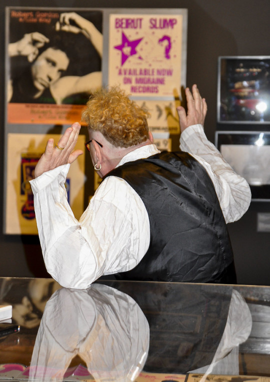
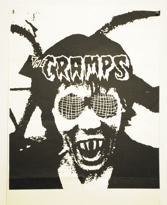
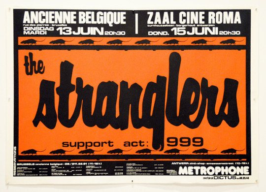
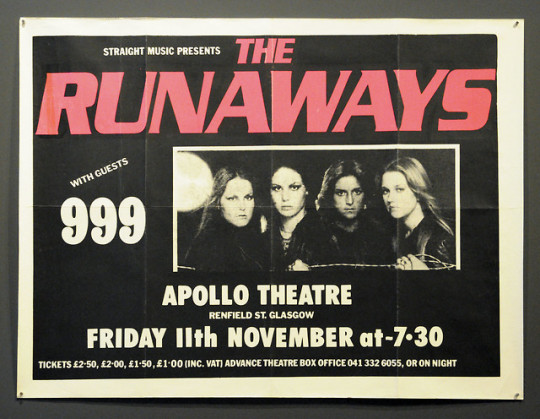
Too Fast to Live, Too Young to Die: Punk Graphics, 1976-1986 by j- No Via Flickr: Museum of Arts and Design Manhattan NYC April 15, 2019
More than forty years after punk exploded onto the music scenes of New York and London, its impact on the larger culture is still being felt. Born in a period of economic malaise, punk’s energy coalesced into a powerful subcultural phenomenon that transcended music to affect other fields, and especially graphic design. Too Fast to Live, Too Young to Die explores the visual language of punk through hundreds of its most memorable graphics, from the shocking remixes of expropriated images and texts to the DIY zines and flyers that challenged the commercial slickness of the mainstream media.
“Too Fast to Live, Too Young to Die charts punk’s explosive impact on design and examines its complex relationship with art, history, and culture,” said Chris Scoates, MAD’s Nanette L. Laitman Director. “Punk questioned everything, and it’s that spirit of inquiry that is driving MAD forward today, presenting and debating innovative works and ideas with lots of energy, color, and noise.”
John (Johnny Rotten) Lydon, of the Sex Pistols and Public Image Limited (PiL), kicked off a full slate of public programs - beginning with an intimate and fascinating (as well as entertaining) interview and discussion at the press preview, which NYTCAP attended.
Other events will include an evening on punk photography with David Godlis, Bob Gruen, Marcia Resnick, and Paul Zone; a night of music with DJ Phast Phreddie; a conversation with Sire Records co-founder Seymour Stein, plus programs focused on punk fashion, band history, and more.
My interest in this exhibition goes beyond my own art and design background, but also as an active participant in the Houston TX punk scene. Leaving my musicianly lack of talent behind, I found refuge as a concert reviewer for the late Public News weekly, and also as a co-producer of KTRU-FM’s cutting edge award-winning and popular punk radio program “The S&M Show”, (”Friday Nights In Hell!”) founded and hosted by the still punk af Marilyn Mock - for 11 years.
Having a huge collection of punk lps, eps, tapes, demos, and 45s, as well as many posters, fliers, zines, and scores of buttons, this was a must-see show. Getting to meet and talk with Mr. Lydon was an added incentive..
Originating at Bloomfield Hills, Michigan’s Cranbrook Art Museum, the exhibition has been adapted for its run at MAD to include selections that showcase the visual output of New York City’s punk scene: flyers from the famed East Village punk venue CBGB; concert posters and memorabilia from Blondie, the Ramones, and other artists; early issues of Punk magazine; and more.
“Since its rebellious inception in the 1970s, punk has always exhibited very visual forms of expression,” said Andrew Blauvelt, Director of Cranbrook Art Museum and Curator-at-Large for Design at MAD. “From the dress and hairstyles of its devotees and the onstage theatrics of its musicians to the design of its numerous forms of printed matter, punk’s energy coalesced into a powerful subcultural phenomenon that transcended music to affect other fields such as visual art, fashion, and graphic design.”
Arranged thematically, Too Fast to Live, Too Young to Die examines a variety of visual design strategies, including parody and pastiche, and techniques such as appropriation and collage. Further, it illuminates the influence of genres such as science fiction, horror, and comics on punk and post-punk graphics. The works on view move from the sobriety of a stripped-down, black-and-white minimalism to the expansive color palettes and expressive forms of New Wave graphics.
Legendary graphic designers Malcolm Garrett and Peter Saville, both of whom have work represented in the exhibition, collaborated with MAD to create original promotional materials, including a subway poster campaign, a three-story banner for the Museum’s facade, and merchandise for The Store at MAD. Garrett’s “Too Fast to Live” graphic—featuring bold black type on a metallic silver ground with a square pop of fluorescent orange—recalls his cover art for the Buzzcocks’ 1989 compilation album Product; while Saville’s “Too Young to Die” borrows its typographic treatment and high-contrast black-and-white colorway from his 1980 design for Joy Division’s Closer album cover.
In addition, from April 25 through July 11, MAD will present a global punk cinema series of films from Mexico, Japan, Cameroon, Hungary, and other countries underscoring the variety of contexts in which punk music has galvanized youth movements for rebellion and social change.
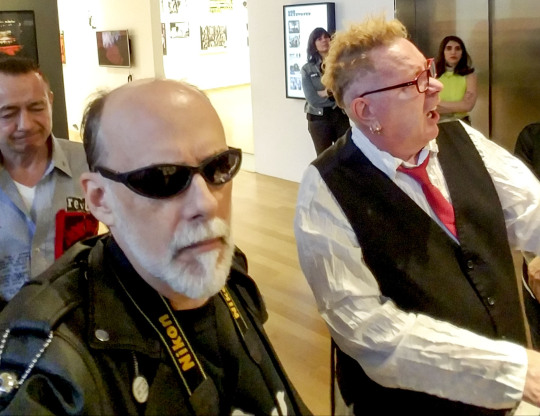
During Museum hours, a multimedia presentation, Please Kill Me: Voices from the Archive, will play continuously in the gallery. Narrated by McNeil and McCain and compiled by filmmaker/artist Brendan Toller, the presentation includes vintage interviews from Iggy Pop, Joey and Dee Dee Ramone, Debbie Harry, Jim Carroll, Billy Name, and others, combined with never-before-seen photographs (including many of Nico) and ephemera from Fred W. McDarrah, Adam Ritchie, Danny Fields, Bob Gruen, James Marshall and Gillian McCain, David Godlis, Leni Sinclair, Mike Barich, Natalie Schlossman, Paul Zone, and Tom Hearn.
#flickr#punkgraphics#museum of art and design#mad#post punk#punk rock#sex pistols#john lydon#johnny rotten#pil#new wave#posters#graphics#zines
4 notes
·
View notes
Text
PitchFest 2019: The Mentors
Twelve finalist with their twelve creative ventures paired up with mentors in the creative entrepreneurship community. These mentors offered hours of expertise to the finalists to help hone their ideas, clarify their plans, and refine their presentations for PitchFest, April 5th, 2019. Their contributions to the process were invaluable and much appreciated.
We got to speak with a couple of the mentors to talk about PitchFest and their experience.

Matthew (Mac) Plumstead designs smartly focused, contemporary furniture and accessory products for the home and office from his studio in Minneapolis, McCarty Quinn. Clients include: Herman Miller, Umbra, Tuohy, and Loll Designs. https://www.mccartyquinn.com/
Why did you decide to become a mentor for PitchFest? “I decided to mentor for PitchFest because, as an industrial designer, I know how valuable it is to develop an idea that resinates with people in their lives. It is not so hard to come up with an interesting idea for a product concept. It is much harder to get that idea to come to life in the marketplace. It starts with a solid narrative. Being able to share why your idea is worth developing is the biggest asset you have for success.”
Why do you think this competition is important to MCAD? “This competition is important for MCAD because it helps prepare students for the real world of being an artist or designer, one where a strong point-of-view and some hustle can result in work or products that can truly change the world.“

Beau Sinchai is a Human-Centered designer and researcher for Target and the owner of Koonyai Studio. Graduated from University of Minnesota and Cranbrook Academy of Art, her work has been part of numerous exhibitions and earned a permanent collection space at the Cranbrook Art Museum. www.beausinchai.com
Why did you decide to become a mentor for PitchFest? “I started my own business when I was a student and found myself dumbfounded in the business world. I didn't speak any business languages and no one in the business world understood me and what I do. I decided to mentor for pitch fest because I want to guide students along this process and be there when they might feel like the business world is scary. All Students have the best idea, but are often afraid/not knowing how to act on it.”
Why do you think this competition is important to MCAD? “Oh, what I would do to have this when I was a student! To have someone believe in you and in your idea enough to give you money for it when you are still a student, alongside business coaching, that's just everything an entrepreneur could ever want.”
We only got to hear from a few of the mentors but here is a complete list of all of the selfless mentors who volunteered their expertise to help their students prepare for PitchFest. You can read more about them and their work bellow!
Terri Barreiro is adjunct instructor of Social Entrepreneurship at the Humphrey School of Public Affairs and Carlson School of Business, U of MN, co-founder of Impact Hub MSP and consultant to nonprofit organizations. https://www.hhh.umn.edu/directory/terri-barreiro.
Tim Brunelle is a creative brand leader, writer, strategist, teacher, public speaker, entrepreneur, drummer and podcaster who’s been at the forefront of marketing innovation and storytelling since 1992. https://timbrunelle.com/
Chris Dykstra explores how entrepreneurship can be an act of art and a force for social justice. He advances the idea that art can function at the intersection of oppression and progress to help us collectively understand and express our most sensitive feelings and point us toward peace and shared prosperity. https://chrisdykstra.com/
Sara Fowler is a graphic designer and illustrator, working primarily with artists and cultural organizations on publication design projects, visual identities, and more. She is also the Art Director of Make MN magazine, and Adjunct Faculty at MCAD.
Hunter Jonakin is a multimedia artist, educator, and game developer. He owns Pomp Life Studios, which is based in Minneapolis. http://www.hunterjonakin.com
Monica Edwards Larson is the proprietress of Sister Black Press - a Letterpress and Book Arts studio. She teaches at MCAD and the Minnesota Center for Book Arts, and runs a side project called Sister Black (Bike) Press. www.sisterblackpress.com
Elliott Payne is a digital strategist and business consultant with over a decade of experience preparing non-profit, private and public sectors for the digital economy. First by modernizing manufacturing facilities, then assisting startups and Fortune 500 companies with digital services. https://www.sense-datum.com
Martin Grider is a contract software developer focused on games, virtual reality and game design. He helps run the Twin Cities chapter of the International Game Developers Association. http://chesstris.com/about/
Craig Laurence Rice is an entertainment executive, entrepreneur, educator, award-winning producer and director who is nationally recognized for his distinguished career in the music industry, commercial, television and feature film industries. His credits include Producer for the 90-minute PBS variety show special, “A Prairie Home Companion 30th,” Executive Producer on the nationally syndicated series “Million Dollar Idea,” and Executive Producer as well as Director for the feature length documentary “Half Past Autumn: The Life and Works of Gordon Parks” for HBO, which was nominated for three Emmy Awards,
and an NAACP Image Award.
Stephenie Rich After working as a marketer in the tech startup world, Stephanie Rich is returning to her journalism roots to launch Starting Up North, a new publication focused on Minnesota. https://www.startingupnorth.com/
Marcq Sung has a background in socially responsible investing, sustainability, public relations and marketing. He is the Director of Business Development for Saint Paul and is certified in economic development finance by the National Development Council and by the ISOS Group in sustainable reporting, as part of their Global Reporting Initiative.

PitchFest is a free event that will be held on Friday, April 5th, 2019 from 5:00 pm-7:30 pm at the Minneapolis College of Art and Design in Auditorium 150. There will be free food and refreshments as well as an opportunity for the audiences to help one of the contestants win $1000!
Register for event at: https://mcad.edu/event/pitchfest
1 note
·
View note
Text
Guerilla Visual Tactics
StreetKraft Features Glass at the Intersection of the Gallery and the Street
2/20/2019
The Winter issue of GASnews is hot off the digital press! Content in this issue is motivated by the theme of SUBVERSION and examines a wide variety of ways in which the glass field hosts, supports and/or promotes the renegade spirit in relation to professional practice. For this issue, I spend time assessing a curatorial effort by Kim Harty entitled "StreetKraft" at the Royal Oaks, Michigan based Habatat Gallery. I was hoping the issue of GASnews would publish far earlier than it did as the exhibition opened and closed within the previous month of September. Regardless, this piece examines an interesting gesture to merge the high-brow context of the blue-chip glass gallery and artists who place their practice (and material relationship) within the guttural modes of self-expression found in street art. There are many more dualities at play within this exhibition that made it an interesting focal point in my constant consideration of this time and place within contemporary glass...and I feel that those stand out in one's reading of this article. it almost demands a follow-up to address things that weren't part of the conversation; things like the brief return of graphics, Imagery and narrative within glass, the brief resurrection of loud, splashy color within conceptually-driven glass work and the socio-political commentary between regional street artists and the artists within StreetKraft about how much "street" may or may not truly present in this exhibition. But until then, this review basks in the yin and yang of StreetKraft's tendency to straddle the fence between reverence and sacrilege visually, conceptually and culturally. Below is the draft I submitted to my Editor in its full, unedited version to serve as supplemental material to what is seen in the Winter 2019 issue of GASnews:
Of all the ways in which the word (k)raft has been scorned as only involving kitsch, misunderstood as only relating to the cheap and the mercantile, and has limited notions of hand-based practice only to the quiet, pious and pastoral comes an exhibition that noticeably turns all those misconceptions on their head. Just outside of the artist utopia that Detroit is resurging to be is the neighboring community of Royal Oak, home to Habatat Galleries. It is here that StreetKraft had been hosted from August 18th to September 15th this past Fall and curated by Kim Harty, artist, writer and Assistant Professor of Glass at the College for Creative Studies. “When I was invited to curate a show at Habatat I wanted to do something that would fit the time and place of the gallery,” mentions Harty. “Detroit has been bubbling with street art throughout the city, and in museums like the DIA and the Cranbrook Art Museum. I also wanted to assemble a show that was very visual, that had a strong sense of imagery, form, and color to bring the viewer into.” In an effort to bridge Harty’s observations of a dialogue that could happen between Habatat and the street art scene of Detroit, StreetKraft was an exhibition highlighting instances of glass thinking from around the world that dwells in the conceptual underbelly of the street: the renegade vernacular of its visual language, its symbology (both real and imagined), its literal tones and its figurative textures. Although initially seen by Harty as an opportunity to create connections between separate creative forces within her region, StreetKraft expands the conversation by inviting artists from a little bit of everywhere...including Detroit, but well beyond it, too. With seventeen artists from various corners of the United States, Poland, Australia and Japan represented in the show, ‘the street’ reveals a diversity of impetus within the work as widespread as the international standing of its participants. Regardless of place, each artist is spoken to - and speaking through - ‘the street’ to explore ideas that evaluate, assess, predict and push a spectrum of issues related to contemporary culture. “I’ve also noticed a counter-cultural thread in glass that isn’t often acknowledged as a trend or theme,” Harty mentions. “Certainly, pipe culture is part of that, but there are many artists working in other genres that have subversive or political content to their work. I wanted to assemble a critical mass of artists to acknowledge the work that is being done and contextualize it together.”
The range of glass vernacular in StreetKraft is as varied as what the individual works are speaking to. Glass processes like blowing, neon, flat glass imaging, kiln forming and flameworking engage a few ties in conceptual approach: Leo Tecosky representative of a shared body of work in the show visually reinterpreting street markings, signage and other guerilla modes of linguistical coding. Emily McBride representative of a shared body of work in the show engaging the generally overlooked emblems of low-class iconography, mass production and other fixed tokens within the daily grind. Esteban Salazar representative of a shared body of work in the show visualizing – even prophesying – concern through city-scaped lens of a perhaps not-so-fictitious, future dilemma involving ecological and societal collapse. Caledonia Curry (aka SWOON) representative of a shared body of work in the show accentuating a romantic angle to the street; of finding and amplifying the extraordinary potential of elements hidden in plain sight within an urban scene. The convergence of ‘the street’ and glass practice in StreetKraft does reveal itself to be a curious intersection to cross…full of interesting ironies between the two platforms of creative inquiry and activity. Various forms of street art, tagging and graffiti being unsanctioned gestures and, therefore, motivated by a sense of immediacy in one’s materials and process. Quickness is key, not only in what is done and how, but boldly in what and how the work visually articulates itself once done and discovered. Glass, on the other hand, is full of rules; not legally enforced, but rules governed by elements of time and temperature in order for anything to survive even its own making. Unlike the street’s immediate modes of visual communication, glass is – even at its quickest mode of processing - time intensive. And expensive. And fragile. Part of what makes StreetKraft such an interesting premise is that it resides in duality; a creative field that demands such sensitivity, consideration and protocol that glass does mingling with a creative field that’s primarily built on aggressive resilience, the gut and subversion. And the sass. The shamelessness and brazen disposition of ‘the street’ crossing over into the sanctified character of how glass is approached, handled and produced for exhibition is interesting, too. The exhibition title invites further upheaval; not only integrating one of the dirtiest words in contemporary glass parlance, but subverting how the term “craft” is both understood by its believers and misperceived by its dissenters…simultaneously. StreetKraft bypasses the notion of (k)raft as but an aesthetically rooted approach to making and demonstrates it existing best instead as a method of thinking by way of doing. Especially in terms of creative activity. Especially more so in terms of street-savvy, insurrectionally motivated matters of making. It is here that StreetKraft claims (k)raft as a verb…not a made thing per se, but the idea of taking action. And if it has to be regarded as a noun, (k)craft as belief system of “fuck you” to the pomp and circumstance of glass, glass making, glass culture and maybe even the context of the blue-chip gallery context. You will not find things like finesse for the sake of finesse here, nor will you find high-end commodities that’ll go with the couch.
Instead, StreetKraft illuminates the philosophical roots of (k)raft under a highly contemporary lens of proficiently wielded sacrilege: making with intentions off the beaten path of the “exquisite art object” and, instead, on the hunt for empowerment…to artist and public alike. The conceptual integration of (k)raft within the notion of ‘the street’ provides an interesting angle to a conversation we thought we’ve talked to death already. To help illustrate, I imagine a twenty-something Basquiat, prior to becoming famous; an adept - yet still unknown - graffiti artist. I imagine him in action in the dead of night. I imagine the agility with which he accesses forbidden public surfaces to enhance. Each step towards his empty canvas a moment to finalize his plans to illegally modify it with his vision. And to modify it brilliantly. I imagine the dexterity with which this proficient, yet to be recognized street artist commands the movements of his can of bargain-bin spray paint. The quick wit of his message, the thoughtfulness of its placement and the timing of its social sting once discovered by an unsuspecting public at first daylight.
In this fictitious moment – of me attempting to identify with someone I’ve never known by way of an art form I’ve never done in a moment that may never have happened – I begin to find parallels of similarity between the two very dissimilar worlds that glass and ‘the street’ are. The engagement of meaningful creative activity, of bodily performance as one chases their vision down, of making creative decisions in real time, in real space and in doing so with real impact internally and externally: this is where the power of (k)raft within StreetKraft resides. On the surface, StreetKraft has much to convey. In this post-millennial, post-recession and post-#yeswecan political and cultural era, StreetKraft hosts glass-based thinking and making as a call to action. When present, the rough-and-tumble contributions to the show elicit a sense of urgency. But the slick and savvy contributions are red flags in and of themselves, representing the calm before an ambiguously predicted storm. And the relationship between a show like this being hosted at a venue like Habatat Galleries is worthy of a longer conversation of its own… “I think [StreetKraft] demonstrates that there is a place for somewhat radical (at least in the glass context) work in commercial galleries,” says Harty. “This show is unlike anything Habatat has done before, yet it actually fits seamlessly into their space.” Even so, StreetKraft doesn’t give a shit about formalities. Pipes exist here, as do sculptural objects, as do image-based works, spatial arrangements, sound-inducing kinetic works, the rough, the tight, things on the wall, things on the floor, things in your face. The correspondence between what is so alluring about ‘the street’ creatively and what is so intriguing philosophically about traditional notions of (k)raft is just so poetically ripe. For starters, I’m drawn to the exhibition’s abstracted comparison of street art in relation to (k)raft’s historical associations with function; the hand and its gestures as a vehicle with which to “produce” a circumstance of “usefulness” in relation to broader areas of critical conversation. But I’m also drawn to elements of conceptual wordplay between the two seemingly different worlds: the impetus of street-inspired art to rise from objection in relation to (k)craft’s historical associations with the object and object making… The immediate connotations of StreetKraft are interesting indeed. But its undercurrents are just so, so rich. For information and images of StreetKraft visit the exhibition catalog here.
1 note
·
View note
Text
Bloomfield Hills gana su cuarto título estatal, por primera vez desde el 18; Seeholm y Cranbrook ocupan el segundo lugar - Auckland Press
Bloomfield Hills gana su cuarto título estatal, por primera vez desde el 18; Seeholm y Cranbrook ocupan el segundo lugar – Auckland Press
Los principales sembrados Bloomfield Hills Blackhawks terminaron una temporada dominante con su cuarto título de tenis masculino en las Finales de la División 1 en los Países Bajos durante el fin de semana, superando al segundo clasificado Northville por 10 puntos y al campeón del año pasado, Troy, por 11 puntos. Bloomfield Hills también ganó títulos de la División 1 en 2015, 2017 y 2018. El…

View On WordPress
0 notes
Text
Martin Venezky Timeline:
1957: Born in San Francisco, California.
1975-1979: Graduates Dartmouth College with an undergraduate degree (BFA in Visual Arts).
1991-1993: Graduates Cranbrook Academy of Art with a Master of Fine Arts (MFA) in design.
1993: Venezky teaches at RISD, CalArts, and California College of the Arts in San Francisco, where he is currently a Professor.
1995: First gains notability for the design of Speak Magazine.
1997: Founded Appetite Engineers', a design firm.
1997: Among I.D. Magazine's "ID40" list of influential designers.
2001: San Francisco museum honors Venezky in with a solo exhibition.
2005: his monograph, 'It is beautiful... then gone' is published by Princeton architectural press.
2015: Venezky is inducted into an esteemed graphic designer club, the Alliance Graphique Internationale (AGI).
2018: Letterform Archive has a collection of his work, studies, and process for their permanent collection.
Sources:
https://www.martinvenezky.com/
https://www.lensculture.com/martin-venezky
https://vimeo.com/247379016
0 notes
Text
This may sort of surprise you because I’m nothing if not regionalist in dignity, but when it comes to scholarship and, to some extent, criticism, I loathe midwest boosterism, for a lot of reasons that have probably already surfaced in your brain just hearing that phrase. And because of so many concerns I have about preservation and boosterism in general, which are complicated politics with which I couldn’t reconcile enough to be a preservationist myself. As an extension of this discomfort, I’ve never really been on board with, say, “flyover” discussions, and so on.
And yet! Maybe I imagine this but it feels like I’m seeing more architecture criticism “discovering” the midwest than I have ever seen before, and it’s bizarre and repulsive to me that I feel like the best response is some kind of flyover narrative about it because it makes no fucking sense. American modernist architecture was born in the midwest, this is not a dispute between schools, this is as canonical as it gets, I’m sure you know this already, there were u know once two cities in between two big lakes that sort of directed the industry and labor flow of the entire nation for a really long time, etc. (Secondary shoutout to St. Louis, I’m not forgetting you.)
So I find myself, well, first of all working on a draft for a pub whose entire premise is flyover ethos, welp, but. I’m reared in this scene full of preservationists and university press local architectural history authors, and I’m frustrated by them because they aren’t producing good criticism, and I feel like they are swallowing the really nasty narratives about our landscapes that came from a corporate and political class in the midwest, and they’re flailing around talking about how nobody respects the role that Michigan played in modernist design, meanwhile Los Angeles is paying more than my mortgage for a Grand Rapids produced chair that I see every week of my life, and my architecture textbooks are all Mrs. O’Leary’s Cow, and I would like somebody anybody to say one critical thing about any Cranbrook affiliate that wasn’t Japanese, you know?
And then Curbed and Dwell publish articles calling one of Michigan’s most toxic and volatile industrial regions an “oasis” and a “small town” because some of the houses have original birch facing cabinets, a named architect and say “organic” on the zillow listing! And then whoever else is like, “you won’t BELIEVE what kind of neat buildings they have in Minnesota” and what am I supposed to do you know
16 notes
·
View notes
Text
Mount Saint Vincent University apologizes for ties to residential school system
Mount Saint Vincent University in Nova Scotia has formally apologized for its connection to Canada's residential school system.
Interim university president Ramona Lumpkin gathered with a group of Indigenous community leaders, residential school survivors and university representatives today to perform a ceremony of apology and commitment on the school's Halifax campus.
Lumpkin noted that the school's founders and previous owners, the Sisters of Charity Halifax, had members who staffed residential schools in Nova Scotia and British Columbia.
Members were stationed at the Shubenacadie Residential School, which was open from 1930 to 1967 about 60 kilometres north of Halifax, and the Cranbrook Residential School in southeastern B.C. from the late nineteenth century to 1970.
Lumpkin also said Mount Saint Vincent would be committing to several actions to improve its relationship to Indigenous people on campus and in the province.
She said commitments include expanding financial aid for Indigenous students and adding more Indigenous content to courses.
This report by The Canadian Press was first published Oct. 20, 2021.
from CTV News - Atlantic https://ift.tt/3phGbrj
0 notes